
The Nifty 50 index has drifted lower recently and has lost close to 8% from the high of 15,431 recorded on February 16, 2021. But though the Nifty 50 has slipped to lower levels, there are quite a few sectors that have delivered positive returns during this period. So, what are the sectors to focus on (and what are the ones to avoid)? Let’s find out.

The top performers
The Nifty Metals index is the top candidate in this category. Have a look at the performance of different sectors from February 16, 2021 till date.
It is apparent that the Nifty Metals, Nifty Commodities and Nifty Pharma sectors have been the top performers when the Nifty 50 index was drifting lower. These sectors are the outperformers and would be the ones to focus on, going forward. Let us take a closer look at the price chart to better understand the technical structure.
Metals: strong outperformance
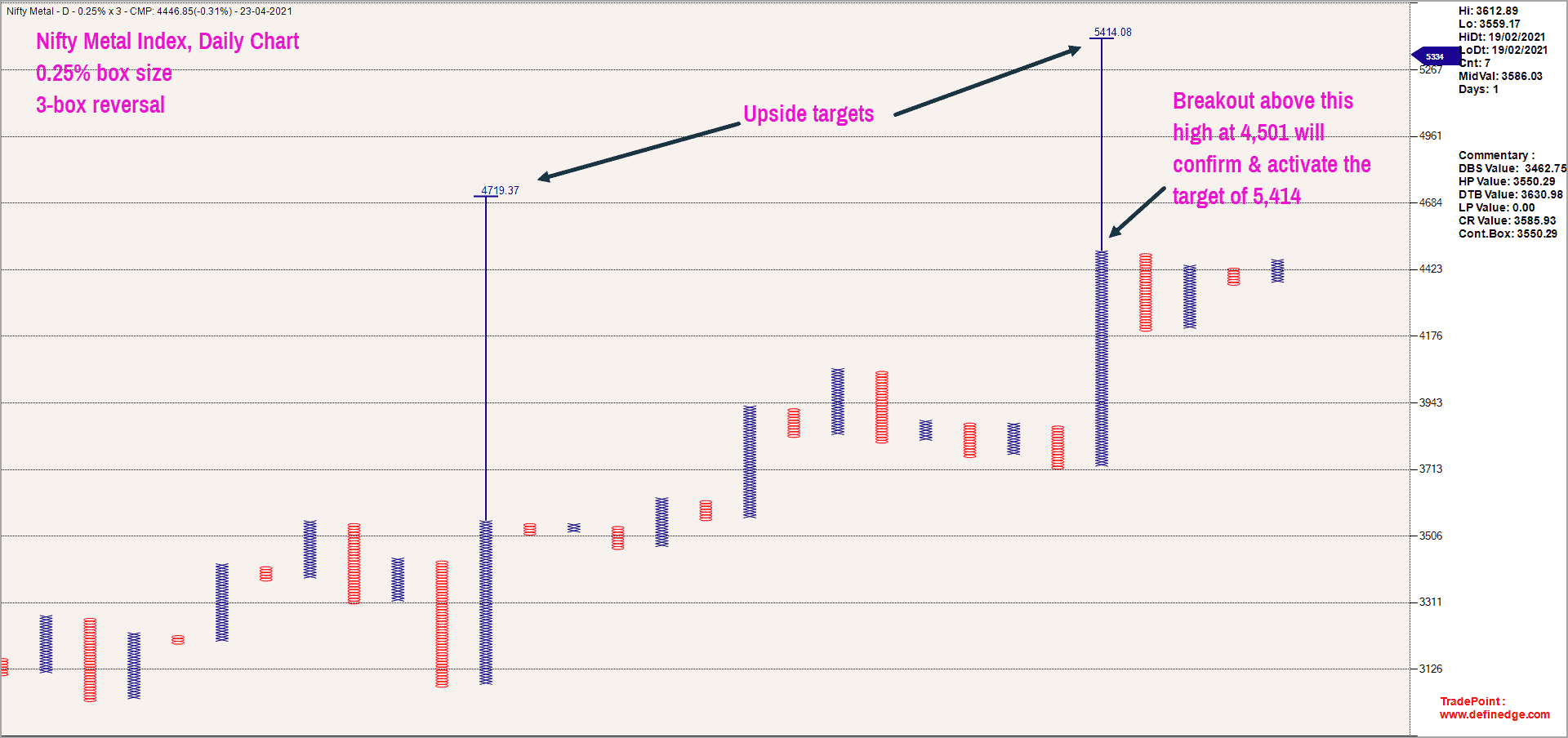
The Nifty Metal index is at an all-time high and the Point & Figure chart indicates the potential of a rally to 5,414. The short-term target is 4,719 which represents an upside potential of little over 6% from the current price of 4,447. The medium-term target (12-16 weeks) of 5,414 would be confirmed only when the Metal index closes above 4,501. The positive outlook for the Metal index would be under threat if the price closes below the swing low of 3,710.
Here is the ratio chart of Nifty Metal index versus Nifty 50 plotted in the Renko chart format. The ratio chart is also trending up smoothly, suggesting strong outperformance of Nifty Metals against Nifty 50.
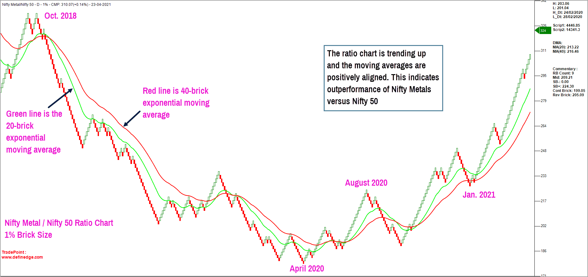
The outperformance of Nifty Metals would continue as long as the price trades above the moving average, and if the short-term moving average is above the long-term moving average. If the price falls below the moving averages, a subsequent negative moving average crossover would indicate the onset of relative underperformance. Until this sequence plays out, a focus on the metals pack can work well.

Pharma: from underperformer to outperformer
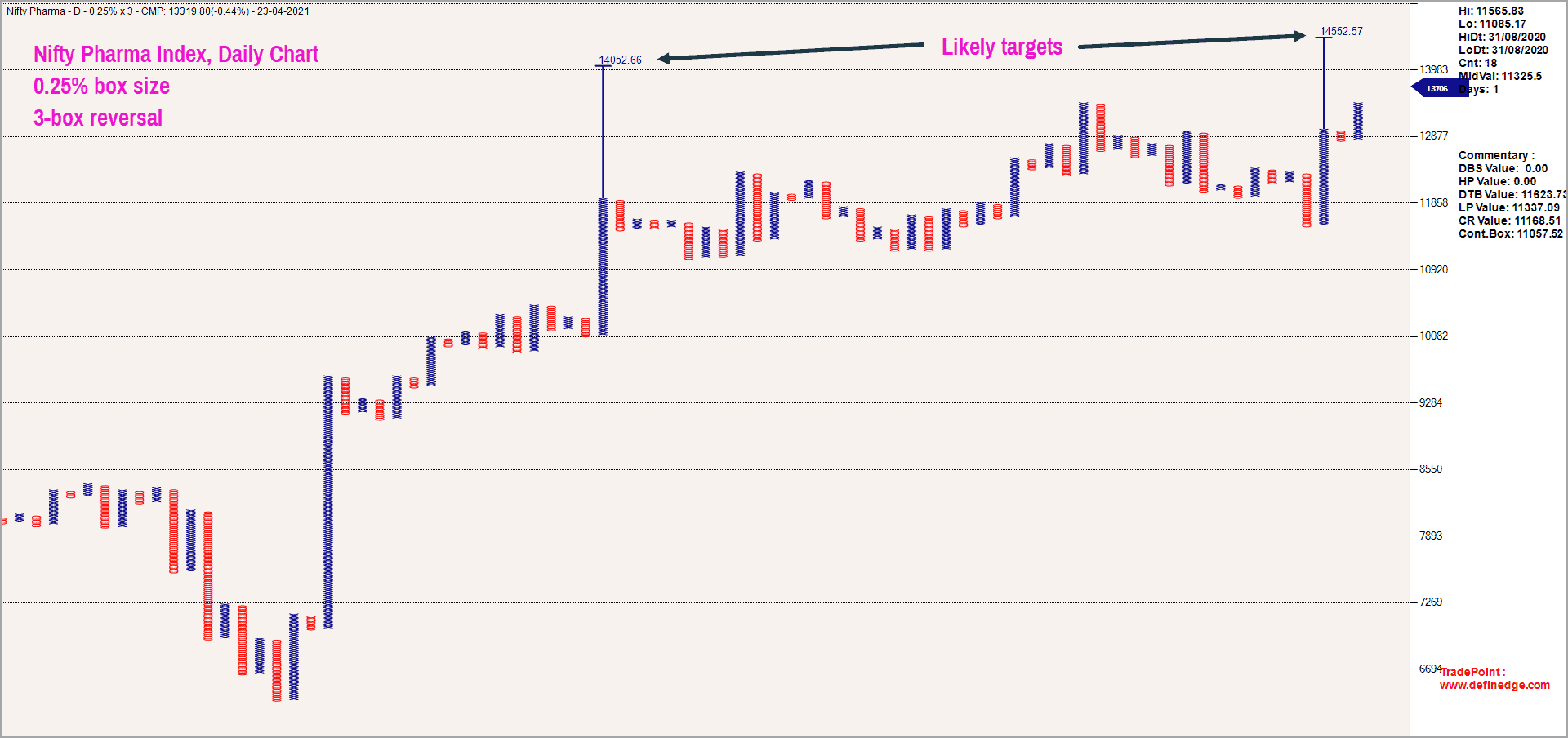
Consider a quick look at the Nifty Pharma index which has resumed its outperformance after a period of underperformance. The image below shows the Nifty Pharma index chart plotted in the Point & Figure format. As observed in the chart, the near-term targets for this index based on the Point & Figure vertical count methodology is 14,052 and 14,552. These targets are likely to be achieved in the next 6-8 weeks. These targets would be invalidated if the Nifty Pharma index closes below 11,000 levels.
The ratio chart of Nifty Pharma versus Nifty 50 is interesting too. Take a look at the ratio chart of these two indices, plotted in the Renko chart format.
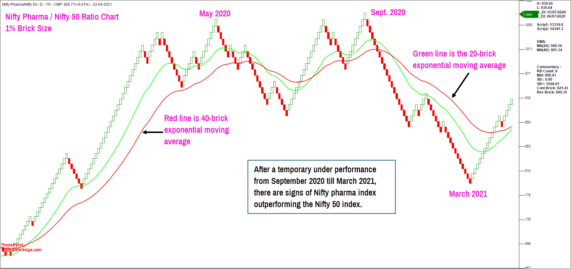
The pharma index dropped sharply during September 2020 to March 2021, indicating relative underperformance of the index against the Nifty 50. However, the overall trend remains bullish, and the recent price action indicates that the pharma index is on the verge of resuming its outperformance.
The price in the above chart has closed above the moving averages. The short-term red moving average is on the verge of a crossover above the long-term green moving average, strengthening the positive outlook for pharma sector.

Slowing sectors
While the Pharma, Commodities and Metals sectors appear promising and could be potential leaders when Nifty 50 resumes its uptrend, sectors such as Nifty PSU Banks and Nifty Realty are showing signs of weakness in both the price chart and the ratio chart versus Nifty 50.
Here is the ratio chart of Nifty PSU Bank versus Nifty 50 index in the Renko charting format.
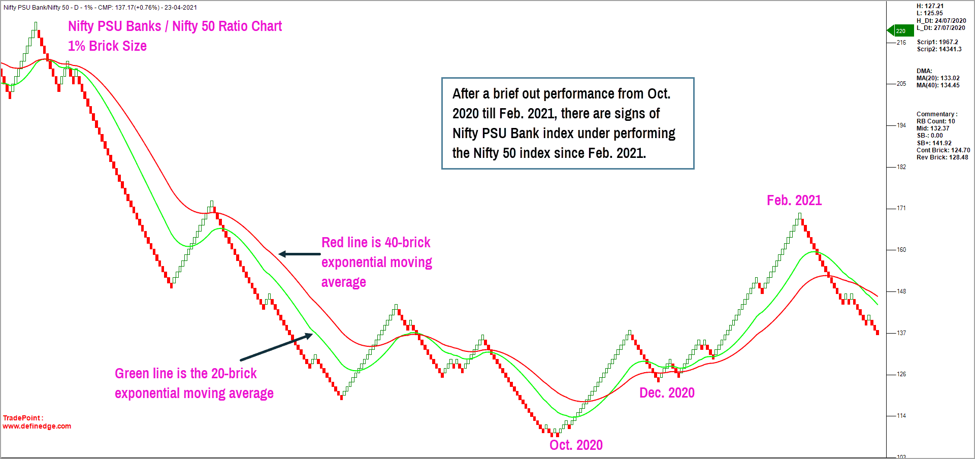
It is evident that the PSU Bank index has been in a long-term downtrend for several years, even with a temporary outperformance between October 2020 and February 2021. The ratio chart has since been in a downtrend and the price has slipped below the moving averages, suggesting underperformance of PSU Bank stocks.
The scenario in the realty index is similar with the ratio chart deteriorating sharply in the past few months. Hence, these are the sectors to be avoided until there is fresh evidence of relative strength.
Sector overview
The table below captures the momentum in the ratio chart of sectoral indices versus the Nifty 50, sorted in the descending order. The scores are calculated on four different box sizes in the Point & Figure chart. The box sizes in the Point & Figure chart are the proxy for assessing the performance across different time frames. The simple logic here is that bigger the ranking score, stronger the outperformance of the index versus Nifty 50.
The sectors at the top of the table are the ones that are outperforming and the ones at the bottom are those underperforming. Here are the takeaways from this table:
- Strong outperformers: Focus on the common sectors that are at the top of these two tables to identify strong outperformers. Sectors such as Nifty Metals, Commodities, Pharma fall in this category. Focus on these sectors in the short-term (8-12 weeks). But wait until Nifty 50 shows signs of resuming its uptrend.
- Relative weakness: Sectors such as Nifty PSU Banks, Realty and MNC sectors are displaying relative weakness and hence can be avoided. MNC’s underperformance versus Nifty 50 is due to the flattish consolidation in the MNC index. However, this could also be a dark horse.
- Short-term weakness that needs watching: There are a few sectors that are displaying short-term weakness including those such as Nifty Auto, Energy & Infra. Watch out for signs of further deterioration which would push these sectors into the same league as PSU Banks & Realty. For now, avoid fresh exposures in these sectors until there is concrete evidence of outperformance and a turnaround in the Nifty 50.
- Potential turnarounds: Sectors that are consolidating and could turn out to be potential outperformers include Nifty IT, Nifty PSE, Nifty Consumption & Nifty FMCG. These sectors could churn out performance if there is a swift recovery in the respective index.
- Uncertain trend: Nifty Bank is currently in a tricky spot. It is underperforming in the short term and outperforming in the long term. We will have to wait for further confirmation.
Before we wind up, it is important to realise that a sector outperformance study would be relevant to pick candidates when the benchmark (Nifty 50 in our example) is in an uptrend. The benchmark or Nifty 50 index is currently in a downward corrective phase. Hence, it would be advisable to keep fresh commitments to the minimum. As and when the Nifty 50 index resumes its uptrend, it would be prudent to focus on the stocks from the outperforming sectors.


18 thoughts on “Technical outlook: Identifying the sectors to focus on and the sectors to avoid”
Hi,
I am a subscriber for the paid plan but still not able to access this article. Kindly help.
This article is open to Prime Growth plan subscribers (our other plan is Prime Essentials). If you’re a Growth subscriber and still unable to access, please write to us at [email protected] and we’ll check on it. – thanks, Bhavana
How are the ranking scores calculated ? If this is something proprietary, then you can share some simple maths that will help us come up with some scores which may be close to accuracy
Hello:
It is proprietary but I do not mind sharing the logic. Before that we need to be on the same page with respect of understanding the basics of Point & Figure charting and ratio charts. If not, the explanation would be of little use.
Thanks
B.Krishnakumar
Thanks. Do you publish this scores on your org website. How often , do you publish these scores.
Hello:
These scores can be generated daily using the licensed (paid) version of TradePoint software. You can visit http://www.definedge.com to take a trial and then decide.
Regards
B.Krishnakumar
Thanks Krishnakumar for this view on Nifty sectorial view. I want to go back to your view on nifty itself. Since the closing violation of 14500 had taken place once, I was looking forward to a correction to 13500 (I do understand that these tech reads are not exact science) but from the looks of it, we are heading to 15000 and beyond again and that is inspite of all the bad news about Covid wave2. Do you want to reevaluate your read on Nifty or you want to revisit that only, if nifty crossed 15400 ? Thanks again
Hello:
We will soon come up with an updated view on Nifty with revised targets, if any. I was expecting 13,500 but, our expectations mean nothing. Price is supreme. I will still be open minded about the possibility of a drop to 13,500. Am waiting for fresh concrete clues to indicate one way or the other. So, stay tuned for an update soon.
Thanks
B.Krishnakumar
The ratio chart of Pharma to Nifty on candlestick/Bar charts shows it is still lagging both on medium, short term as 50 day and 200 day average are lower. However, Renko charts for Pharma and Nifty shows they are outperforming. Please let me know your thoughts, how do we read the outperformance on these charts -Renko and Bar/candlestick charts
Hello:
Even in the Renko chart, the ratio is displaying signs of promise. It is turning around. The long term trend is still positive while pharma index has been underperforming recently. It is mentioned in the write up too. I have also mentioned that there are early signs of promise in the Renko chart. The moving averages are on the the verge of crossing over. It is still work in progress. You can choose to wait for moving average crossover to happen in regular ratio chart before committing funds in pharma sector.
For those stocks which are not part of an official index like say chemicals, then you can study the ratio chart (of stocks from that sector) versus Nifty 50 index. For example, if 6 to 8 chemical stocks are outperforming the Nifty 50 index then you can focus on that sector. Of course, always have a clearly defined exit plan. Remember, your profit is a function of the quality of your exits.
You can plot ratio chart of any stock versus Nifty 50 at http://www.tradepoint.definedge.com. You can register for free here and access ratio charts in line format. You can plot those moving averages and take decision.
Regards
B.Krishnakumar
Hi,
Excellent technical analysis. Once a particular sector is identified, there should be another follow up analysis as to which companies within high performing sectors are best for trading point of view.
Milind
Hello:
Thanks for your feedback. I wish to stay clear of stock specific recommendations. You can either go through the mutual fund route or consult your financial advisor regarding stock specific advice.
Regards
B.Krishnakumar
Sir, chemical are also playing out well. I understand we do not have any index to measure them. How do we track them
Hello:
For those stocks which are not part of an official index like say chemicals, then you can study the ratio chart (of stocks from that sector) versus Nifty 50 index. For example, if 6 to 8 chemical stocks are outperforming the Nifty 50 index then you can focus on that sector. Of course, always have a clearly defined exit plan. Remember, your profit is a function of the quality of your exits.
You can plot ratio chart of any stock versus Nifty 50 at http://www.tradepoint.definedge.com. You can register for free here and access ratio charts in line format. You can plot those moving averages and take decision.
Regards
B.Krishnakumar
Thank you very much. It’s exciting to see your analysis. I remember you had shown ratio charts with candlestick/bar charts. That’s easy to follow than point and figure as well as renko charts. Can you please display those charts as an addendum to the above charts. That would be of great help.
Hello:
You can plot ratio chart of any stock versus Nifty 50 at http://www.tradepoint.definedge.com. You can register for free here and access ratio charts in line format. You can plot those moving averages and take decision accordingly. Personally, I feel Renko chart & Point & Figure chart offer a little bit more clarity and helps make more informed decision. If ratio line chart with moving averages are what you are comfortable, then please visit the link above.
Regards
B.Krishnakumar
Thank You very Much. Very much appreciate your quick response. Ratio charts on Renko and point and figure are not available for free registration. Is that right ? I could only see line.
Hello:
The free version will have the line charting option alone. You need to get a paid subscription for renko / P&F charts. But if you are not someone who is full time into markets / trading, I would believe even the free version with line charts would serve the purpose. As long as you are on the right side of the trend in the ratio chart, you must be good to go.
Thanks
B.Krishnakumar
Comments are closed.