
While the Nifty 50 index has seen a sharp pull back in the last few trading sessions, there has also been a tectonic shift in how individual sectors have fared versus the Nifty 50. Sector rotation is clearly the name of the game. In the previous post on sector performance, we used a line chart with two moving averages (50-day & 200-day) to identify outperforming and underperforming sectors. Let us take this forward and use the Point & Figure charting method, a more sophisticated way to assess relative outperformance and underperformance by sectors.

For those unaware of it, Point & Figure is one of the oldest charting methods which falls under the noiseless charting category. Here’s how it works.
- The price action in a Point & Figure chart is captured via alternating columns of X & O.
- A column of X represents rising price.
- A column of O represents falling price.
- Each box of X or O represents the chosen price scale
- This price scale is called as the box size in Point & Figure parlance.
You can refer to the following links if you are keen to know more about how this wonderful chart is constructed: https://www.definedge.com/point-figure and https://www.youtube.com/watch?v=o_l7SNM1QhQ. The second link above is a brief 30-minute video which explains the construction part of Point & Figure chart.
If you aren’t keen to know how to construct such charts and are only interested in applying them to your investing decisions, you can safely skip the above and learn to interpret it as follows.

Understanding Point & Figure
To understand how it works, let us look at the ratio chart of Nifty Auto versus Nifty 50 in the Point & Figure format.
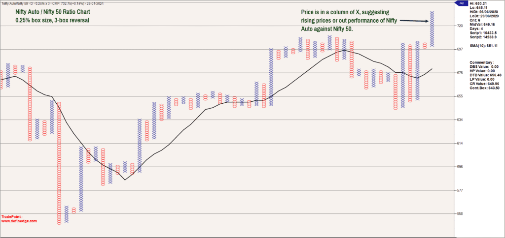
If you notice, the box size or scaling is 0.25% in the above chart. That is, every box of X or O in the above chart represents a 0.25% move in the price. The price is now in a column of X suggesting that the ratio chart is rising. This effectively means that the Nifty Auto index is outperforming the Nifty 50 index. It is possible however to evaluate this ratio based on different price scales, also called ‘box sizes’ of your choosing.
The table below captures the momentum score of all sectoral indices versus Nifty 50 across four different box sizes. We use four box sizes to get a holistic picture of performance across multiple time frames. To simplify, the box size in the chart captures price action in a particular time frame. Bigger the box size, longer the time frame. A 0.25% box size captures the short-term price action while a 3% box size captures the broad monthly trend.
Interpreting the scores
Moving out to identifying outperformers and underperformers, the above table is sorted in the descending order of total score. A positive score indicates outperformance, and a negative score indicates underperformance. The bigger the positive number, the better the outperformance.
If you notice, Nifty Auto is the only index which has a positive score across all four box sizes suggesting that it is outperforming the Nifty 50 index across multiple time frames.
The Nifty FMCG index is at the bottom of the table with negative scores in 3 out of four box sizes. The score is positive in the 0.25% box size indicating that there is outperformance in the short-term. But it remains to be seen if this outperformance sustains and percolates to longer time frames.
You may recall that the Nifty Metal index was one of the top outperformers when we published the sectoral analysis a few weeks ago. But the Metal index has displayed signs of underperformance lately and has slipped in the ranking order. The Metal index is now underperforming in the short-term and medium term while the long-term outperformance is still intact. This suggests that the sector is losing this sheen and could be avoided until there are fresh signs of outperformance.
Nifty Bank and Nifty IT index are also displaying signs of outperformance and these are the ones to focus on if there is recovery in the Nifty 50 index.
The sectors with bottom scores such as Energy, FMCG and MNC are the ones that should be ignored.

Relative performance
Download and keep this Excel sheet open. The table in this sheet captures the performance of each sectoral index versus others. We consider the 19 sectoral indices offered by the National Stock Exchange.
The table linked above is based on a 0.75% box size. Think of the table as an arm-wrestling match between each sectoral index against its rivals, with the total score being provided. Another way to interpret this is to view it as a round-robin contest in an IPL T-20 tournament where each team competes with every other team in the play-offs.
If you notice, Nifty Auto is right at the top indicating that this index is outperforming all other sectoral indices on a relative basis too, including the Nifty 50. The Nifty Auto sector would therefore be the one to focus on, when there is a recovery in the Nifty 50 index.
The Nifty PSE, CPSE, PSU Bank & Realty Sectors are at the bottom of the table suggesting that they are underperforming against most other sectors. You may recall that in the previous post, the PSE, CPSE & PSU Banks were displaying early signs of promise but that seems to have faded away now. These sectors are the ones to avoid from a short-term perspective of 8-12 weeks.
Takeaways
To summarise, we have used a dual approach to assess sectoral performance.
- The first table captures the performance of each sector in relation to the Nifty 50 index.
- The second table is the round-robin format where each sector is pitted against every other sector to assess the final tally.
- Focus on the common sectors that figure at the top of both tables to identify strong outperformers.
- Sectors such as Nifty Auto, IT and Nifty Bank fall in this category. Focus on these sectors in the short-term (8-12 weeks). But to do this, wait until Nifty 50 shows signs of uptrend.
- Sectors such as Nifty Energy, PSE & CPSE are at the bottom half in both tables. Hence, avoid these from the short-term (8-12 weeks) perspective.
- There are a few sectors that are interestingly poised. The list includes FMCG, Consumption & Pharma. These sectors are outperforming most other sectors in the recent past. But their overall performance in multiple time frames (refer the first table) is not that promising.
- Keep an eye on FMCG, Consumption and Pharma. These could be the dark horse sectors if the recent outperformance persists.

Also Read : Nifty Analysis as on 7th March, 2021


12 thoughts on “Point & Figure charts – Identifying sector winners and losers”
I think if the update can be periodic and fixed, like 5th of every two months, it helps for any rebalance actioin that we need to take. Please consider this suggestion.
Hello:
The plan is to come up with regular updates and expect the next article to be an update to the sector rotation theme.
Regards
B.Krishnakumar
Sir, Bank and Auto fared as per takeaways from your approach. Very well done.
Do you wonder why IT didn’t. Is there a blind spot you find in hindsight?
Also the commodities space — metals, infra did exceedingly well. Was that a surprise?
Thanks for your help.
Hello Sir:
We are talking about different time frames and relative performance. Auto and Banks performed relatively better than Metals. Am not saying that metals did not perform but they were at par with Auto. Again, remember that the out-performance and under-performance is not linear. They do undergo temporary counter trend moves. It is essential to choose the right time frame that suits you and focus on the sectors concerned. There will always be temporary bouts of under-performance within a long-term outperforming cycle. This could be something that is playing out in metals, IT & Pharma.
And, if the relative performance shows sustained underperformance and if the price too signals an exit, then it is a sign to lighten holdings in that sector.
Hope this helps.
Regards
B.Krishnakumar
Good info Sir.
Two questions sir.
1. Is this methodology applicable to find under/over performing consituents within a index?
As an example within Auto index, which companies have performed better/worse than the index itself?
If one is buying equities than MF, that info would be helpful.
2. You mention about focusing on over performers when Nifty50 gets into uptrend. How to look to see if the recent performers were not distributed as selling on strength. Because if they were done so, one would be holding a losing bag.
Hello sir:
Let me address your query point wise:
1. This methodology is applicable to individual sectors too. Using the same approach or method, you can identify outperforming or under-performing stocks within a chosen sector. This can help in stock selection.
2. Your second question is very interesting and pertinent. This is why we look at two different tables and approach here. The excel sheet attached in the post captures long term trends and we look at the performance across multiple time frames. The other table featured in the copy captures short-term performance. So, keep an eye on both these tables. You will get valuable insights about short-term as well as long-term shifts in sectoral performance.
When the trend in Nifty 50 turn positive, you can look at these two tables in conjunction to get an idea about the sectors to focus and ignore.
Hope this helps.
Regards
B.Krishnakumar
Sir,
Thanks for your reply.
While the constituents of metal index are around All Time Highs and is correcting now, the auto index components are far from ATH.
That is a big difference between the two.
I have limited to looking up the top three sector index components (TataSteel, JSW, Hindaldo in Metal and Maruti,Mahindra in Auto — BajajAuto is at ATH)
When a equity is at a new ATH, there is bound to be supply in multiple forms — shortsell, tired holders etc.
Just want to make sure , wheat is separated from chaff.
The recent out performance of Auto and under performance of Metal is nothing new. Hope one does not lose the view of forest in search for trees.
Metal components have multiplied several times this year while Auto have done either double or a bit more.
Hello:
That is a valid point that you have raised. But, please be reminded that we are talking about entirely different time frames here. While what you are referring to is from a medium to long term perspective, the post that I wrote is from extreme short term perspective. Obviously, there can be variance between positioning of sectors across different time frames.
Hope this helps !
Regards
B.Krishnakumar
How to calculate momentum score? Which section in trade point to be used?
Hello:
In TradePoint software, Please go Matrix—>RS Matrix to get the ranking or momentum score. You can get the second table scores from Matrix—>Ultimate P&F RS Matrix menu
Regards
B.Krishnakumar
Thank you Krishnakumar for this very educational article. How do we get the latest scores of various sectors from time to time? Also, it deems like this chart is meant for short term investors (not for buy & hold strategies?)?
Hello Sreenath:
Glad to know that you found the post educative. The table and the charts used in the post are generated using the TradePoint software which is developed by Definedge Solutions, based in Pune. You can take a free trial at http://www.definedge.com and then decide if you wish to subscribe to TradePoint.
Regarding the time frame, I have focused on short-term as I would be revisiting and updating them regularly. You can change the parameters and focus on long-term too. But again, you need TradePoint software to do that.
Regards
B.Krishnakumar
Comments are closed.